As the largest social media platform on the internet it is critical to understand the components of the advertising options.
Here is the overview breakdown for you:
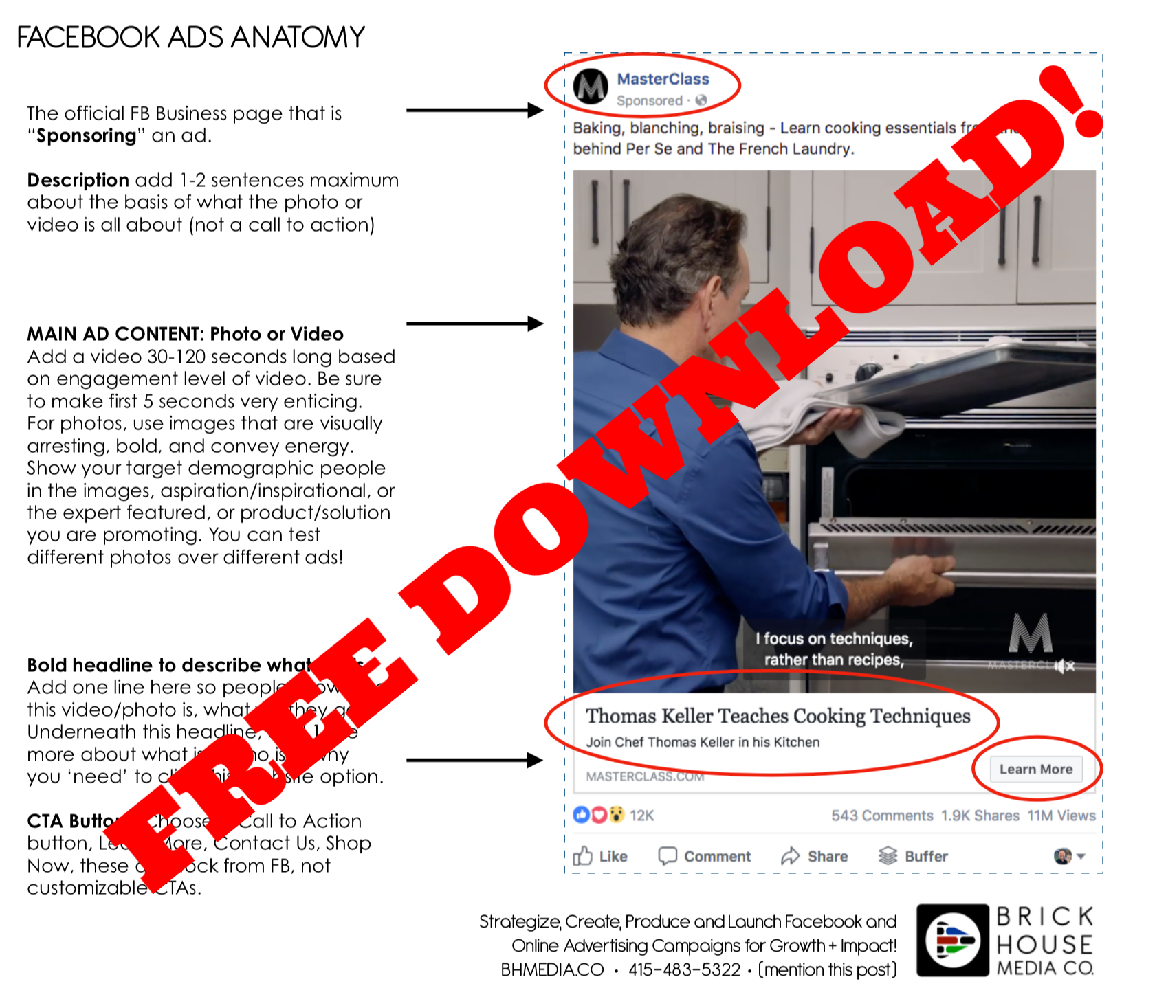
Sponsoring: Facebook let’s viewers know what business page is ‘sponsoring the advertisement.
Description: Allows you to add 1-2 sentences maximum about the basis of what the photo of video in the ad is all about. This is not a call to action (CTA) area.
Main Ad Content: Leverage a photo or video (30-120 seconds) long based on engagement level of the video. Be sure to make the first five seconds of your video very visually enticing. For photos, use images that are visually arresting, bold and convey energy. People’s faces do better even if you are advertising a product and service. Show your target demographic people represented as aspirational/inspirational, or the expert featured, or product/solution you are promoting. You can always test different photos over different ads to see which one is getting you better results (A-B testing featured).
Bold Headlines: Describe what this is by adding one line here, so people know what the video/photo is all about. What will they get? Underneath this headline, add 1 line more about what is it, why they ‘need’ to click this, as a website option. Use the classic marketing ethos, WIIFM (What’s In It For Me) what problem does it solve, what pain does it take away?
CTA Button - This call to action button, most commonly used as Learn More, Contact Us, Show Now, these are the stock options from FB and are sadly not customizable at present. Be sure to link this button to a website page or online store you control. You can skip the homepage and take them directly to a sub-menu page on your site.
Still have questions… good that means you are paying attention here. Feel free to schedule a free media strategy consultation with Jared from Brick House Media Co.


